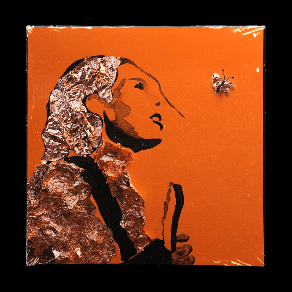

The shape was chosen from hundreds of experiments with her initials.
Water Droplet was added in real life
and captured by camera at a specific moment.
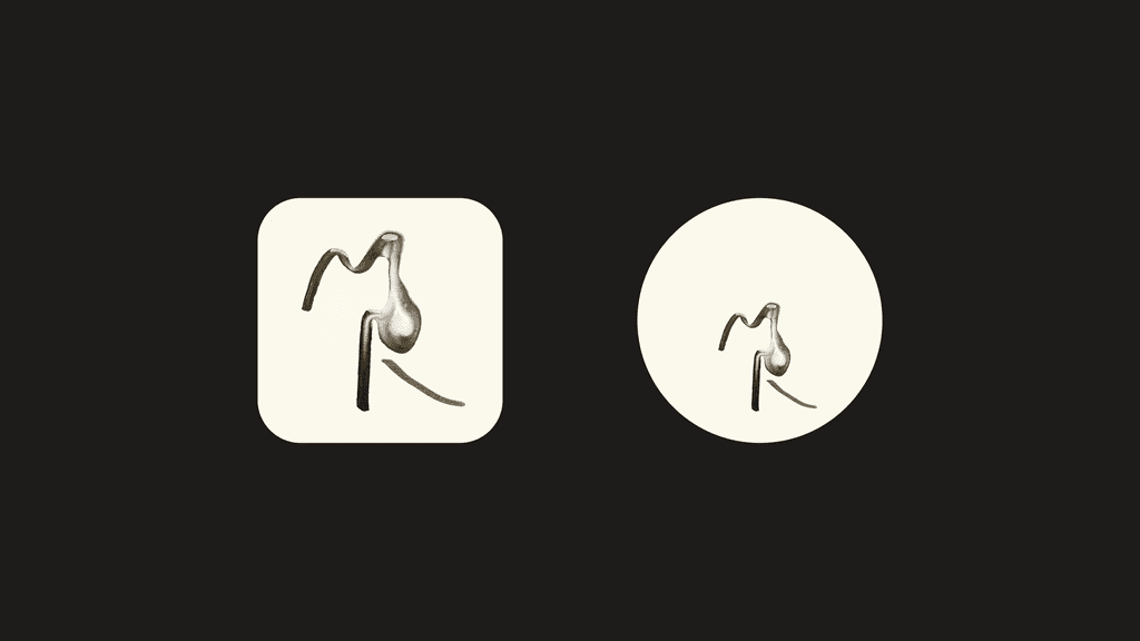
The shape was chosen from hundreds of experiments with her initials.
Water Droplet was added in real life
and captured by camera at a specific moment.
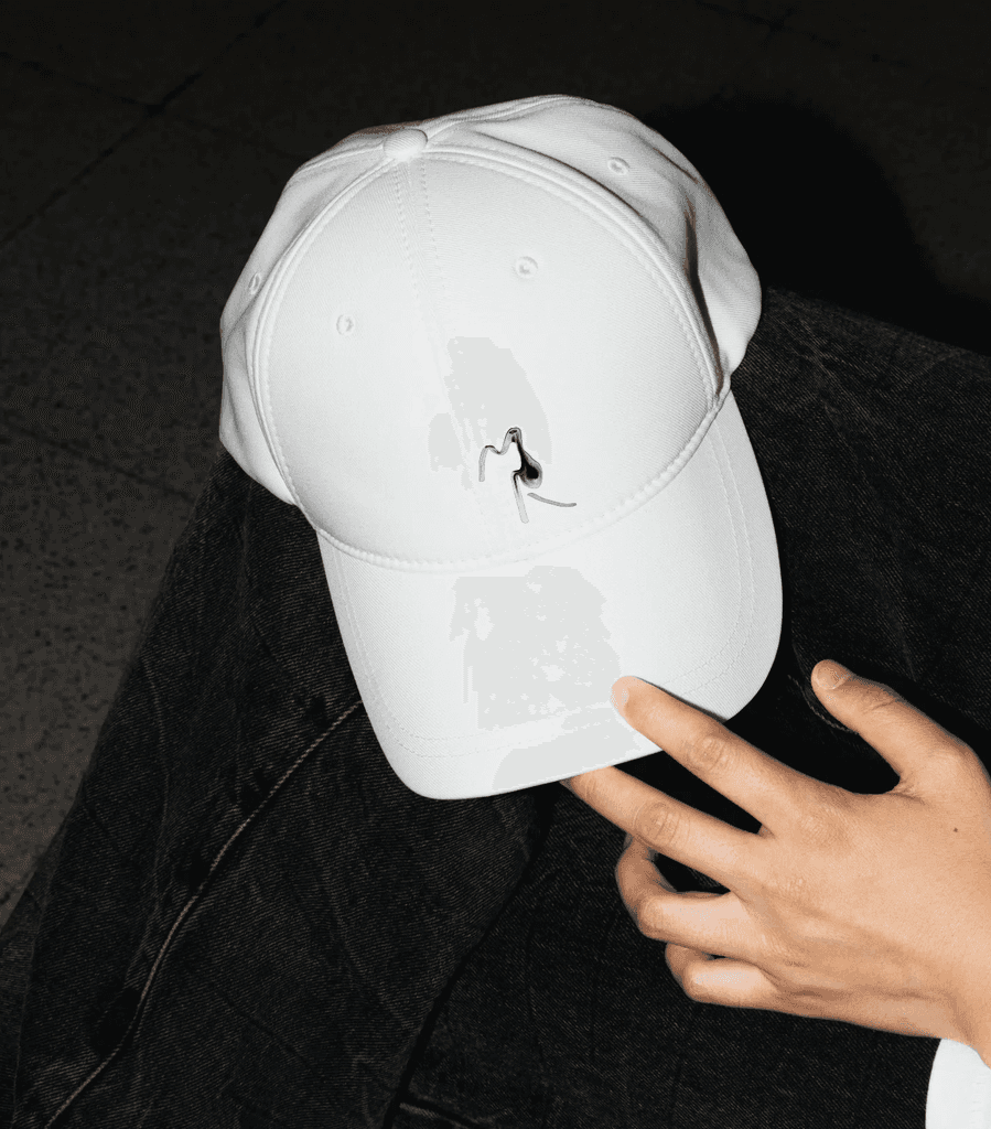
The shape was chosen from hundreds of experiments with her initials.
Water Droplet was added in real life
and captured by camera at a specific moment.
